

This is a placeholder text
Group text


by MaxBear on 27 February 2008 - 14:02
You must take into consideration, your Monitor. It has almost as much distortion and colour effect as the camera you use. What you may be seeing in a photo, may not be what someone else is seeing. Of course we must also take into consideration, our own vision and degrees of colour vision.

by venzosmom on 27 February 2008 - 15:02
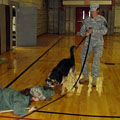
I always seem to get two different colors-these were taken about a minute apart ..jpg)
.jpg)

by darylehret on 27 February 2008 - 15:02
Good point. Color calibration of the monitor is a priority for preparing documents and images for print publication. Some higher end imaging programs compensate for this, by adjusting the appearance of the images within the software's interface, that would ultimately look more saturated and vibrant on computer screen in web-use than they would in published print.
Also, I've noticed but often forget, that I can see more detail in an image when looking at my flat screen monitor from a slight angle, rather than perpendicular to it.
If you wanted, I guess you could desaturate the image yourself to see a more accurate representation of color in your imaging software, but I don't think you couldn't reverse contrast as easily.
by Ceph on 27 February 2008 - 15:02
Photoshop CS2 actually you can do a fair amount of stuff in. You have a Brightness/Contrast gauge that changes very easily...and CS2 haqs the added bonus of being able to change exposure.
However - there are pictures on this website that if you gave to one person or to one hundred, I imagine the general look of oversaturation would be the same...the bleeding is what really kind of throws me on that - that isnt my moniter showing the red bleeding into the black - it's the picture.
Venzousmom - the color of the two pictures isnt that different, and the difference that is ther you can tell is from the lighting...in one picture the camera probably picked up less exposure and in the other more - thats something that happens often with the auto setting on cameras.
I'll try to go through my pics and see if there are some there that I might be able to play with the kind of show what I am thinking about. There's one or two ads that come to mind....but I'd rather use my own examples.
~Cate
by darylehret on 27 February 2008 - 18:02
Here's a comparison of the pic SchHBabe posted, after being desaturated. Without question, it looks improved to my eye, and I don't understand why someone would intentionally want to overdo it. It's a "turn off" in alot of peoples opinions.


by venzosmom on 27 February 2008 - 18:02
Wow, I like the second one better .
Contact information Disclaimer Privacy Statement Copyright Information Terms of Service Cookie policy ↑ Back to top