

This is a placeholder text
Group text


by gouda on 04 January 2015 - 21:01
by vk4gsd on 04 January 2015 - 22:01
i would post the actual document, not a story about the document and let the evidence speak for itself.
yr source has a blatent history of telling lies, here is some of his lies and why/how they are lies. why so gullible gouda, according to you the world should have ended by now, what matters global climate trends if there is no world??
Claim: "Fact: We Haven't Seen Any 'Global Warming' for 17 Years!"
Response: Luongo uses three disingenuous tricks to back this claim. First, he uses RSS data, which, as I have already noted, shows false cooling since 2000. The second is that he starts his graph at 1998 and ends at 2014, which is 16 years, not the 17 years he claims. The third is that he starts his graph at 1998, an exceptionally warm year. How exceptionally warm was 1998? Residual graphs give an idea. The general idea with a residuals graph is to remove any trend in the data first, then examine what is left to pick out data that is well above or below the overall trend. Here are the standardized residuals for UAH satellite data after first removing the 1979-2014 linear trend.

Note that large residual spike in the graph above? That's 1998. What that graph shows 1998 was anomalously warm above and beyond the general warming trend in the satellite data since 1979. There's a general rule of thumb in statistics that you should never start a trend at a data point that was either anomalously above or below the trend. Luongo, if he took statistics, should have learned that. Yet starting a trend at an anomaly is precisely what Luongo does. It doesn't take a genius to figure out why he picked 1998.

Notice anything? The starting point really does make a difference in the measured trend. Starting from almost any point other than 1998 gives roughly the same trend. Starting from 1998, the year of the largest El Niño on record and the year of the largest residuals in the satellite record, gives quite a different answer. That is precisely why Luongo chose to begin his trend in 1998. He didn't like the answer he would get if he started in any other year and went with the only time period that would give him his desired answer. His "technique" is the very definition of cherry-picking.
Claim: "We’ve had cooler summers and longer winters."
Response: Only in the last two years and only in the eastern and central USA. Remember 2012-2013? The Year Without a Winter? Spring has been arriving earlier, an average of 10 to 14 days earlier than it did in the late 1980s (Karl et al. 2009), which means winter is getting shorter, not longer as Luongo claimed. Besides, the US is only about 2% of the globe's land surface. Care to take a look at what temperatures have been for the entire planet? Here are some graphs from an earlier set of posts on the subject (found here and here):
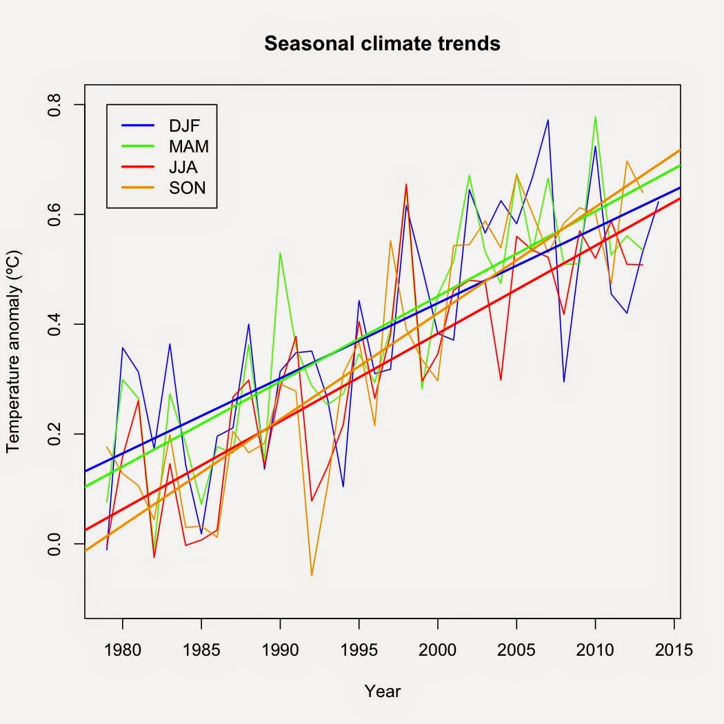 |
| Seasonal trends for global temperature data. |
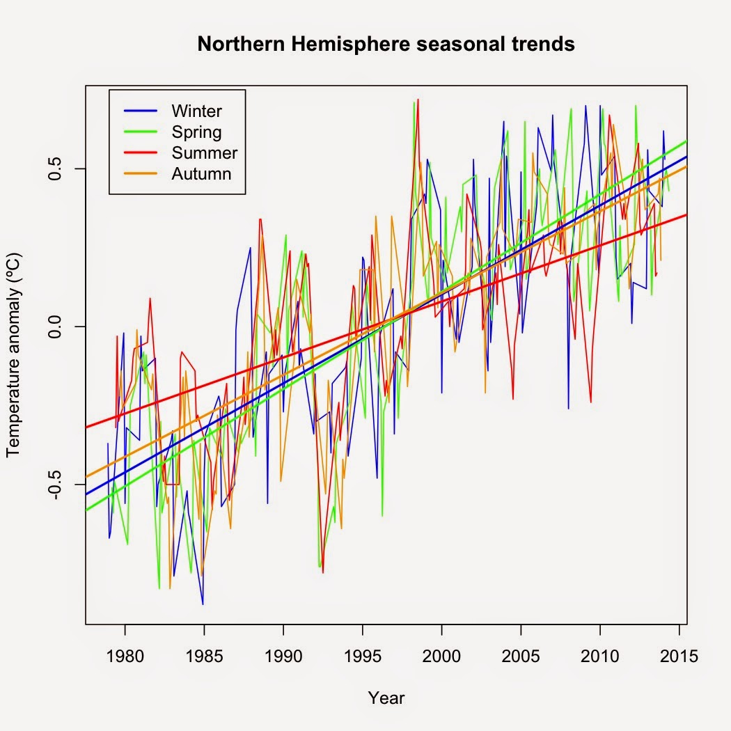 |
| Seasonal trends for the Northern Hemisphere |
See any signs of cooling in the summer? Me neither.
Claim: "Lie No. 2: The Oceans Are Getting Warmer"
Response: It's no lie, Mr. Luongo. It's a fact.

Claim: "Fact: The North Polar Ice Cap Is Increasing in Size!"
Response: I think this graph says enough:

See that red ellipse? That's the only part that Luongo wants you to pay attention to. That's where he's getting his "43% to 63% increase" claim. He's just paying attention to the ice since the record low of 2012. But look at the rest of the data and his claim rings hollow, as that so-called rebound is still a 28% loss compared to 1979. Also note that there was a temporary "rebound" after every new record low—and there's no sign as yet that the latest "rebound" will be any different.
Claims: "Shame on Them, Because That 97% Figure Is Completely Fabricated. "..."When further review was done, it was discovered that a mere 1% of scientists believe human activity is causing most of the climate change."
Response: Sheer and utter nonsense. Multiple surveys of both scientists and the published literature have repeatedly shown that 97% of bona fide climate scientists agree that human activity is to blame for global warming (i.e. Oreskes 2004, Doran and Zimmerman 2009, Anderegg et al. 2010, Farnsworth and Lichter 2012, Cook et al. 2013). The Doran and Zimmerman (2009) study also found that 86% of all scientists, not just climate scientists, agree that human activity is to blame, not 1% of all scientists as Luongo states. So where is he getting his ridiculous claim?
Claim: "In outrage, a petition was signed by more than 31,000 scientists that states..."
Response: The Oregon Petition Project has been repeatedly debunked for shoddy methods (i.e. here, here, and here). Of the signatories, only 0.1% are climatologists. The inclusion criteria are so broad (anyone with a Bachelor's degree or higher in any science, from agriculture science to physics) that over 10.6 million Americans qualify to sign the petition—which means only 0.3% of eligible Americans signed that petition. That's hardly evidence that scientists disagree with the general consensus.
Claim: "Fact: There Has Always Been, And Always Will Be Climate Change"
Response: This is true—and completely irrelevant. It's the rhetorical equivalent of claiming that there have always been forest fires so humans cannot cause any forest fires.
Claim: "Now, the Question Is . . . What Does Cause Climate Change"
Response: This section is absolutely ridiculous. Luongo blames ALL of global warming on the 11-year sunspot cycle, completely ignoring the empirical evidence that conclusively shows that the increase in carbon dioxide is the main cause. The main problem with Luongo's thesis, beyond the numerous research papers conclusively demonstrating that the sun is not the cause of the current global warming? Sunspots numbers have declined since 1957 whereas global temperatures have risen. In other words, the sun has cooled and become less active since 1957 whereas the planet has warmed.

The mismatch is even more evident with an 11-year moving average.

The correlation between global surface temperatures and sunspot numbers since 1957? Extremely weak (r = -0.083) and the wrong sign to boot. IF Luongo's thesis had any validity, the relationship should be positive, not negative.
Simply put, his "science" is sheer and utter nonsense. The only people who will be fooled by Luongo's "science" are those who have not or cannot examine the data themselves. The rest of his article is simple quote mining and character assassination that skirts very close to libel. The only question is why Luongo sinks to such nonsense given his very real science background.
Contact information Disclaimer Privacy Statement Copyright Information Terms of Service Cookie policy ↑ Back to top