This is a placeholder text
Group text
by sueincc on 12 June 2007 - 19:06
I take it back. I want the "middle finger" icon mentioned by 4pack and I want it to say "BITE ME" because I think it would be funny. I would also like that icon where the smiley is banging it's head against a wall over & over because that pretty much summs up how I'm feeling on the spay/neuter thread running right now.
by Oli on 16 June 2007 - 22:06
Well here is the 2nd sample,
I must say that these design folks really don't appreciate us who work on the web for hours a day. They seem to always design a snapshot good for a newspaper rather then a working website. But both these designs are elegant and good indicators of what the casual browser would want to see. I just need to spend the next weeks and figure out how to get all these new ideas to work, (and whether I want to use them or not)
Regards
Oli
by marci on 16 June 2007 - 23:06
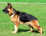
Having TABS... looks good... Yes I also miss the Dog in the waterfalls... And can you tell us who's the GSD in the upper left corner???... You really have a good sense of aesthetics Oli... Making it GREY is formal and is suitable for all ages... The caricature??? (keep it under TABS for progeny)... The Navy Blue headings should stay... You're doing great OLI... and can I suggest having regular sections for our breed experts like vet corners and S.V. authority... FCI judges corners for all breeds ... I think the well discussed topics in the messageboard could be outlined and archived in the General Articles (which I think is being neglected by the way) and in case you will have a "How-to's page or a tutorial...emphasize on what the PDB is known for...Links to special features should stay in the upper left and right sides and you could introduce the Tabs there... those links to the left and right are very useful like while you're reading an arguement in the messageboard and suddenly a name of a dog appear...you can simply search for the name of follow a link to his breed records...
Have a nice weekend Oli...
:) Marci
by anika bren on 18 June 2007 - 01:06
Hi Oli,
I looked at both new designs. Both were hard on the eyes, very glaring and to much contrast. The current design and color scheme is nice and soft.
When I first found this site I was looking for GSD pedigrees. From the first day I found it it has been on my favorites. I have always found it easy to navigate.
Thank you for putting so much time, effort and thought into this website. I really enjoy it.
Donna
Contact information Disclaimer Privacy Statement Copyright Information Terms of Service Cookie policy ↑ Back to top


